Chef Gina’s Bakeshop
ART DIRECTION & DESIGN
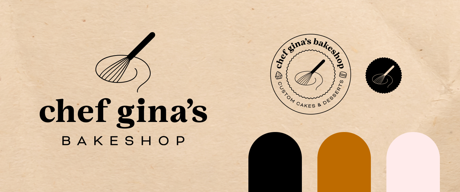
THE CHALLENGE Rebrand beloved local bakery, Chef Gina’s Bakeshop, while paying homage to her original logo. Mandatories: Elevated, yet not stuffy. Include pink in color scheme. Wants to see options with a whisk in the logo.
THE SOLUTION A set of logos that Gina can employ across a variety of use cases, including a logo mark, badge and icon. Pairing a chunky serif font with a wide sans serif font, we were able to achieve a professional yet humanistic personality for the brand. Showing the whisk in motion with a swirl gave it some dynamism. Asimple color palette simple (butterscotch, black & pink buttercream), allow her many colorful creations to stand out in her marketing materials and website.
BEHIND THE SCENES As the sole designer on this freelance job, I presented several ways in (some not including a whisk!), and together, Gina and I collaborated to bring her updated vision to life.


